TL;DR
- Quartz countertop images work fine for shortlisting and mislead badly for final decisions.
- Screen color profiles, studio lighting, and the jump from 4-inch sample to full slab all shift how a color reads once it's installed.
- View a full slab in person under your kitchen lighting before you commit.
- This guide covers what photos capture, what they miss, and how to test a color for real.
Why do quartz countertop images look different in real life?
The gap between a product photo and what lands in your kitchen is real, and it runs in a predictable direction. Photos flatter. Three things drive the difference.
Professional product photography uses controlled studio lighting, often color-corrected LED panels tuned to make stone surfaces pop. Your kitchen has whatever mix of recessed downlights, under-cabinet strips, and window light you happen to own, and that mix shifts all day. A quartz that photographs as a warm cream under studio light can read greenish under cool daylight fluorescents.
Your monitor or phone screen almost certainly isn't calibrated to any professional color standard. sRGB coverage varies widely across consumer displays, and HDR panels in particular tend to oversaturate stone images [1]. The same file looks like two different colors on a MacBook Pro versus a budget Android phone.
Veining is the detail photos ruin. Quartz slabs run about 55 inches by 120 inches or larger. A photo shrunk to 800 pixels wide compresses all that movement into a thumbnail. Patterns that feel busy in person can look subtle online, and the reverse happens too. A single vein that sweeps four feet across a real slab might not even land inside a cropped product shot.
Use images to shortlist. Never to decide. Get a physical sample of anything you're serious about, then look at it in your actual kitchen at morning, midday, and evening light before you order.
What do the most popular quartz countertop colors actually look like?
Quartz brands now sell somewhere between 50 and 200 colors depending on the maker [12], and the whole catalog sorts into a handful of families that photograph reasonably well at a high level. Here's how each one behaves when you go from screen to slab.
White and near-white. The biggest category and the most deceptive to photograph. True bright whites (Silestone Blanco Zeus, Caesarstone Puro) shoot clean and stark. Put them in a real kitchen with warm lighting and they shift warm or read slightly yellow. Whites with thin gray or gold veining almost always look busier in person than in photos, because the veining catches raking light in ways a flat image can't fake.
Gray. Cool mid-grays photograph fairly accurately because they sit close to a monitor's white point. Light grays with subtle aggregate show up poorly online, since the texture reads as flatness. Dark charcoal grays look blacker in photos than they are in the room.
Beige and warm neutral. These shift the most between photo and reality, because warm undertones react hard to your cabinet color and wall paint. A beige that reads taupe online can turn distinctly pink or gold next to white shaker cabinets.
Black. High contrast, and relatively safe to judge by photo. What photos miss is the reflectivity of a polished black surface. It reads like a mirror in a bright kitchen and can feel visually heavy in a way the swatch never warns you about.
Looks-like-marble. Probably the largest subcategory in quartz now, driven by people who want the Calacatta and Statuario look without the maintenance of real marble. Photography shows the pattern fine. It misses how dramatic the veining feels at full slab scale. A pattern that looks elegant in a 6-inch chip can feel overwhelming across 40 square feet of island.
For a side-by-side on how quartz stacks up against natural stone, both visually and in daily use, the marble countertops and granite countertops guides are worth reading before you lock in a direction.
How do slab images compare to sample images, and which should you trust more?
Trust full-slab photos over sample chips, and trust neither over a physical sample in your own kitchen. A countertop chip is usually 4 by 4 inches or 6 by 6 inches. A full slab runs around 55 by 120. That scale gap produces what designers call the area effect: colors and patterns look lighter, more uniform, and calmer at small size, then darker, busier, and more intense at full scale [2].
This is not a photography quirk. It happens with physical samples too. So adjust any chip or image in your head before you judge it. Expect the finished counter to read a shade darker and expect any pattern to feel more present.
Full-slab photos, like the yard shots many fabricators take, beat product photography for exactly this reason. The whole vein movement is visible. So is the color distribution across the surface. If your fabricator doesn't post slab photos, ask them to send pictures of whatever stock they have on hand before you place an order.
Manufacturer galleries usually show full installed kitchen scenes, which helps you read a color against common cabinet finishes. They're styled photos, not your kitchen. But a styled kitchen beats a small isolated chip every time.
What details do quartz images capture well versus what they miss?
Photos are honest about the basics. Overall color family, general pattern type (solid, fine aggregate, bold veining), and rough value (light versus dark) all transfer through good photography with reasonable accuracy. Past that, they fail in specific, repeatable ways.
Texture and finish. A honed quartz and a polished quartz in the same color can look nearly identical in photos. In person they feel like different products and behave differently in light. Honed surfaces show fingerprints and water spots more in daily use, which matters a lot for kitchen life and which no photo will ever tell you.
Depth. Engineered stone with glass or mirror aggregate has a visual depth that flattens out in photos. Some Cambria and MSI products look almost dull in images and genuinely striking in person, because light bounces through layers of aggregate. See cambria countertops for more on how their patterns photograph versus how they present in a real kitchen.
Scale of movement. Covered above, worth repeating: a photo cannot simulate how a bold vein sweeps across a 10-foot run of counter.
Edge profiles. Fabricators offer 8 to 15 standard edge profiles (eased, beveled, ogee, waterfall, and others) that change how a slab reads once installed. Most product images show the slab flat, no visible edge. If you care about the edge detail, ask for edge samples or hunt for installation photos that show the edge clearly.
Seams. Photos almost never show where seams fall in a real installation. Quartz slabs have a maximum size, and most kitchens need at least one seam. Where that seam lands on a veined material matters a lot. A fabricator who does good layout work will drop seams at inconspicuous points and match pattern direction across the joint, but that skill is invisible in product photography.
How do different quartz finishes photograph differently?
Polished photographs richer than it lives, honed photographs flatter and lighter, and textured finishes barely translate at all. Polished is the default finish for quartz and the one in the vast majority of product images. High gloss, strong reflection. Studio lighting is built to make that reflective surface gleam, so photos push it more dramatic than it feels in a working kitchen.
Honed (matte) quartz has no reflective sheen. It photographs flatter and sometimes slightly lighter than the polished version of the same color, because there's no specular highlight catching your eye. Plenty of people find honed finishes more livable and easier to keep looking clean between wipes, though they aren't actually easier to clean, just more forgiving of surface variation [3].
Leathered or brushed finishes, which some brands call "suede" or "concrete," add a tactile texture that photographs as a slightly irregular surface. These are the hardest to judge by photo, because the texture is the whole point and texture is a three-dimensional thing.
One rule for finishes: if the finish matters to you, don't choose it from a photo. Request a finish sample in the exact color you're weighing.
How do quartz countertop images compare across major brands?
The major quartz makers (Caesarstone, Cambria, Silestone, MSI Q, Cosentino, LG Viatera, among others) all publish big online image libraries and visualizer tools. Quality is all over the map.
Caesarstone's gallery is large and consistently lit, which makes color comparisons within their catalog reasonably reliable. Their room scenes are clearly CGI renders [6], worth knowing, because a CGI scene is color-accurate to the render, not to any real kitchen.
Cambria shoots some of the best full-slab photography in the business [7]. Their images convey scale and movement well, partly because their patterns are distinctive enough that they have to.
Silestone has poured money into lifestyle photography of installed kitchens [10]. Great for imagining the material in context, weak for color accuracy, because the shots are heavily styled.
MSI and other value-tier brands run smaller, less consistent image libraries. For those, fabricator stock photos and physical samples matter even more.
Brand aside, the most useful images for a buying decision are almost always the ones your local fabricator pulls from their own inventory. A slab in their warehouse, shot in natural light with a phone, beats a polished studio shot of a slab that might not match the batch they actually have.
For other engineered surfaces, corian countertops and formica countertops each have their own visual quirks worth knowing before you settle on quartz.
What should you look for in kitchen visualizer tools that use quartz images?
Use visualizers for layout and concept, not for color matching. Every major quartz brand offers one now. You upload a photo of your kitchen or pick a template scene, then swap countertop materials in and out. These tools have gotten genuinely better over the last five years and are worth using as one input among several.
The limits are real. Most visualizers map the material onto a flat countertop plane at whatever resolution their image library holds. Veining direction is usually randomized or tiled, which is nothing like how a fabricator would orient a real slab. The cabinet and wall colors in the template scenes might not match yours closely enough to mean much.
Better move: find installed kitchen images that match your cabinet color and layout type, then search reviews and photos of your specific quartz color in those settings. Houzz [9], plus interior design communities on Reddit, plus individual manufacturer galleries all hold user-submitted installed photos that beat professional visualizers, because they show real conditions and real light.
For the install itself, countertop installation covers what happens between locking in your material and having finished counters.
How does lighting affect how quartz countertop colors look in photos and in person?
Light color temperature is measured in Kelvin, and it swings hard between common sources. Standard incandescent bulbs run around 2700K (warm yellow). Cool white LEDs run 4000 to 5000K (bluish white). Daylight through a north-facing window can hit 6500K or higher [4]. Quartz shifts color with every one of those.
A white quartz with warm undertones can look distinctly cream under 2700K and nearly pure white under 5000K. A gray with blue undertones reads obviously blue under cool daylight and almost neutral under warm incandescent. Same slab, different room, different color.
Product photography usually shoots in the 5000 to 6500K range, because that range renders detail well and makes surfaces look clean. If your kitchen runs mostly warm bulbs or gets warm afternoon sun, the material in a product photo can read noticeably different once it's in your space.
Here's the test that works: hold your physical sample under your kitchen lighting at different times of day. Morning is often the most unflattering, because you get blue-toned daylight mixed with artificial fill, which exaggerates every undertone the material has.
How do quartz images compare to images of other countertop materials?
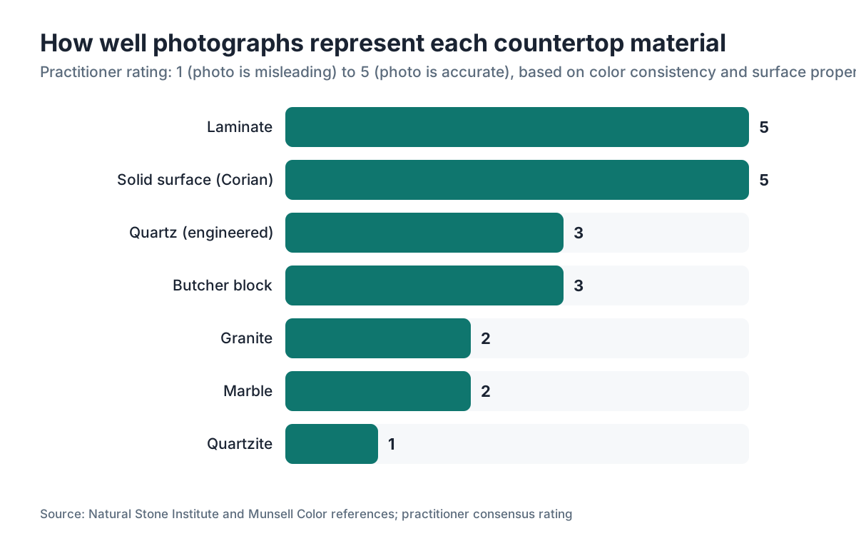
Quartz photographs more honestly than natural stone and less honestly than laminate. It's more consistent slab-to-slab than granite or marble, so a product image is a reasonable stand-in for what you'll actually receive. Quartz is manufactured and color is controlled, while marble and granite come out of the ground in limited runs where every slab is one of a kind [5].
Granite can vary a lot between slabs sharing a color name. An image of "Uba Tuba" granite is a type specimen, not your specific slab. See granite countertops for why that matters when you buy.
Natural stone like marble countertops or quartzite (see how to clean quartzite countertops for material properties) carries even higher variability. Quartzite gets misidentified in product photos constantly [11], which causes real problems for buyers who choose from images alone.
Laminate and solid surface like Corian photograph almost perfectly, because they have no depth or translucency to lose. If an image of a laminate countertops option appeals to you, the real thing will look essentially identical.
| Material | Color consistency slab-to-slab | How well photos represent the material |
|---|---|---|
| Quartz (engineered) | High (manufactured) | Good for color family, limited for texture/scale |
| Granite | Low (quarried) | Poor (image shows a type, not your slab) |
| Marble | Low to moderate | Poor (same reason) |
| Quartzite | Low | Poor, plus misidentification risk |
| Laminate | Very high | Excellent |
| Solid surface (Corian) | Very high | Excellent |
| Butcher block | Moderate | Fair (grain varies) |
What questions should you ask your fabricator about slab images before ordering?
Getting useful images out of your fabricator is a skill, and it starts with asking for the right thing. Most fabricators stock slabs from several manufacturers and can often pull the exact slab you'll receive before production, especially for premium colors.
Ask this, word for word: "Can you send me a photo of the actual slab from your inventory, not a manufacturer image?" A good fabricator will shoot the slab in their yard, ideally in daylight. Even a phone photo of the real slab beats a studio image for judging the specific material you're getting.
Ask about batch consistency. Some quartz colors, especially whites with heavy veining, vary noticeably from one manufacturing batch to the next. If your project needs two or more slabs, ask whether they come from the same batch. Photos of multiple slabs from that batch show you the real variation range.
Ask where the seams will fall and whether they can show you a layout drawing. Shops running digital templating and quoting software, such as SlabWise, can produce cut-layout images that show exactly how slabs get positioned and where seams occur. That's the closest thing to a preview of your finished counter, and it's far more useful than any product photograph.
Ask about edge detail samples. If you want anything beyond a standard eased edge, look at an actual sample in your chosen material. Edge profiles are nearly invisible in quartz product photography, and they change the character of the finished counter a lot.
How can fabricators use better quartz slab images to win more jobs?
For the shop owners reading this: the image problem is your opening. Most of your competitors still push customers to manufacturer websites for color selection. A fabricator who builds even a basic library of their own slab photos, shot in consistent natural daylight in the yard, is handing customers something genuinely more useful than a studio render.
A few practices that pay off. Photograph each slab when it arrives, before it's cut. A 30-second phone session per slab builds a real library inside a few months. Organize by color name and date so you can pull inventory photos fast when a customer asks. It also documents batch variation, which cuts down disputes.
Send layout renders or cut diagrams before templating when you can. A customer who sees where their seams will fall and how the veining orients on their island is far less likely to be surprised at installation. Surprise at installation is where disputes, remakes, and one-star reviews come from.
For Instagram and your website, installed kitchen photos convert better than yard shots. If you have a solid relationship with a past client, offer a follow-up visit to shoot the finished kitchen (with their okay). A library of 20 real installed kitchens, photographed in natural light, sells harder than any manufacturer marketing.
Quoting software like SlabWise helps here too, since it generates slab layout images as part of the quote, giving customers a visual before they've even signed.
What are the most reliable sources for accurate quartz countertop images?
The single most reliable image is your fabricator's photo of the exact slab in their inventory. Everything else ranks below it. Here's the honest order, most to least reliable for an actual buying decision:
- Your fabricator's photos of the specific slab in their inventory.
- User-submitted installed kitchen photos on Houzz, Reddit, or Google reviews (real conditions, real light, real kitchens).
- Manufacturer full-slab photography on the major brand websites (good for pattern and color family).
- A physical sample in your kitchen (not an image, but the best reference you have).
- Manufacturer room visualizer tools (useful for layout context, unreliable for color).
- Pinterest and design blog imagery (often filtered, color-graded, and heavily retouched).
- Amazon and Home Depot product photos for remnants or samples (fine for ordering a sample, useless for color).
The most common buying mistake is flipping this list upside down: burning hours on Pinterest and brand websites, then skipping the physical sample. Physical samples are usually free or a few dollars. Get them before you make any final call.
Frequently asked questions
Can I accurately pick a quartz color from online images alone?
Not reliably. Online images handle overall color family reasonably well but consistently miss finish texture, the scale of veining patterns, and how a color shifts under your specific kitchen lighting. Shortlist with images, then request physical samples in your top two or three choices and view them in your actual space at different times of day before you commit.
Why does my quartz sample look different from the full countertop that was installed?
This is the area effect: colors and patterns look lighter and calmer at small scale, then darker and more present at full scale. It applies to physical samples and photographs alike. A 4-inch chip will nearly always look lighter and less dramatic than 40 square feet of the same material. Expect it and adjust when you judge any sample.
What is the most realistic way to preview quartz countertops before buying?
Ask your fabricator to photograph the actual slab in their inventory in natural daylight and send you those shots. Then get a physical sample of that color and bring it home. Set it on your counter against your cabinet doors, backsplash tile, and flooring under morning light, afternoon light, and your evening kitchen lighting. That sequence is the closest preview short of a mock installation.
How do I find images of quartz countertops in kitchens that look like mine?
Houzz is the best tool for this. You can filter by cabinet color, layout type, and countertop material. Search the color name you're considering plus your cabinet finish (for example, "white oak cabinets quartz countertop"). Reddit's home improvement and interior design communities also hold large libraries of user-submitted real kitchen photos.
Do quartz visualizer tools from manufacturers give accurate color previews?
Partially. They help you understand how a color reads in a kitchen versus in isolation. They aren't reliable for precise color, because the rendering engine, your screen calibration, and the template kitchen's lighting all add variation. Treat them as a layout and concept tool, not a color-matching tool.
How do I tell quartz from quartzite in photos?
It's genuinely hard, and misidentification is common even in professional listings. Quartz (engineered) tends toward more uniform patterning and a more consistent surface. Quartzite (natural stone) often shows organic movement, area-to-area variation, and sometimes subtle translucency at the edges. When in doubt, ask the supplier for the material data sheet or manufacturer name rather than the product name.
What quartz finish should I choose if I can't see it in person?
If you're choosing blind, polished is the safer bet for photography accuracy, since it's what roughly 90% of product images show. Honed and leathered finishes look different in person than any image suggests, so you're more likely to be surprised. For honed or specialty finishes, a sample is non-negotiable before you order.
Why do white quartz countertops look different shades of white in different photos?
White surfaces are the most sensitive to light color temperature of any countertop material. The same white quartz photographs differently under warm studio lights versus cool daylight, and looks different again under your specific kitchen lighting. White quartz images across manufacturer websites are essentially incomparable, because lighting conditions are never standardized.
How important is veining scale when choosing quartz from images?
Very important, and routinely underestimated. A fine-veined pattern in a 6-inch sample or small photo can feel overwhelming at counter scale, and a bold vein that seems dramatic in a small image can look elegant and well-spaced across a full run. Always look for installed kitchen photos showing the full counter run before finalizing a veined quartz color.
Where can I find free high-quality images of quartz countertops for a design project?
Most major manufacturers (Caesarstone, Cambria, Silestone, MSI) offer downloadable product images through their designer portals, usually free with registration. Houzz's image library allows free browsing. For commercial use in publications or marketing, most manufacturer images require written permission regardless of the free access.
Do images of quartz countertops look different on a phone versus a computer screen?
Yes, sometimes a lot. Phone OLED screens often show more saturated colors than desktop monitors. A beige that looks warm and golden on a phone can look cooler and more neutral on a calibrated desktop display. If you're making a color decision, view images on multiple screens and weight your physical sample more than any screen.
Are quartz countertop images from Pinterest reliable for color selection?
No. Pinterest images are frequently filtered, color-graded by photographers, and often labeled with inaccurate product names. An image tagged as a specific quartz color may have been edited to look warmer, brighter, or more saturated. Use Pinterest for style and layout ideas, then verify actual product colors through manufacturer galleries and physical samples.
Sources
- International Electrotechnical Commission, IEC 61966-2-1 sRGB color space standard: Consumer display color coverage varies widely; sRGB is the reference standard for web images but many consumer screens deviate significantly, affecting how stone colors render.
- Munsell Color, color perception and area effect reference materials: Colors appear lighter and less saturated at small sample size and darker and more intense at large scale, a perceptual shift known as the area effect.
- NSF International, NSF/ANSI 51 Food Equipment Materials standard: Honed and polished surface finishes differ in light reflectance and tactile texture; neither finish designation alone determines cleanability or maintenance burden.
- U.S. Department of Energy, lighting and color temperature guidance: Light source color temperature is measured in Kelvin, ranging from roughly 2700K for warm incandescent to 6500K or higher for cool daylight, which shifts how surface colors appear.
- Natural Stone Institute (formerly Marble Institute of America), natural versus engineered stone comparison resource: Engineered quartz is manufactured under controlled conditions producing higher color and pattern consistency between slabs compared to quarried natural stone.
- Caesarstone, product color collection and visualizer, official brand resource: Caesarstone publishes a large standardized online image gallery allowing within-brand color comparisons; their room scene images are noted as CGI renders.
- Cambria, design gallery and full-slab photography library: Cambria produces full-slab photography for its product line, providing better pattern scale representation than small-sample images.
- U.S. Geological Survey, National Minerals Information Center: Quartz is among the most produced industrial stone surfaces in the U.S.; its engineered manufacturing process distinguishes it from quarried natural stone in consistency.
- Houzz, platform overview and image search functionality, official product resource: Houzz hosts user-submitted installed kitchen photos that can be filtered by material, cabinet color, and style, providing real-world quartz installation references.
- Silestone by Cosentino, surface collection and finish overview: Silestone's product line includes polished, honed, and textured finishes; the brand's marketing photography emphasizes lifestyle styling over technical color accuracy.
- Natural Stone Institute, quartzite identification and misrepresentation guidance: Quartzite is frequently misidentified and mislabeled in the market; visual inspection and product documentation are needed to distinguish it from marble or engineered quartz.
- IBISWorld, Kitchen Cabinet and Countertop Manufacturing in the US, industry report summary: Quartz is now among the top-selling countertop materials in the U.S. residential market, with major brands offering 50-200 color options.
Last updated 2026-07-09